
Noordzeeoverleg Branding and Website UI.
Harmonizing Visions: Crafting a Unified Visual Identity for Noordzeeoverleg's Commitment to North Sea Sustainability
The process
Website UI:
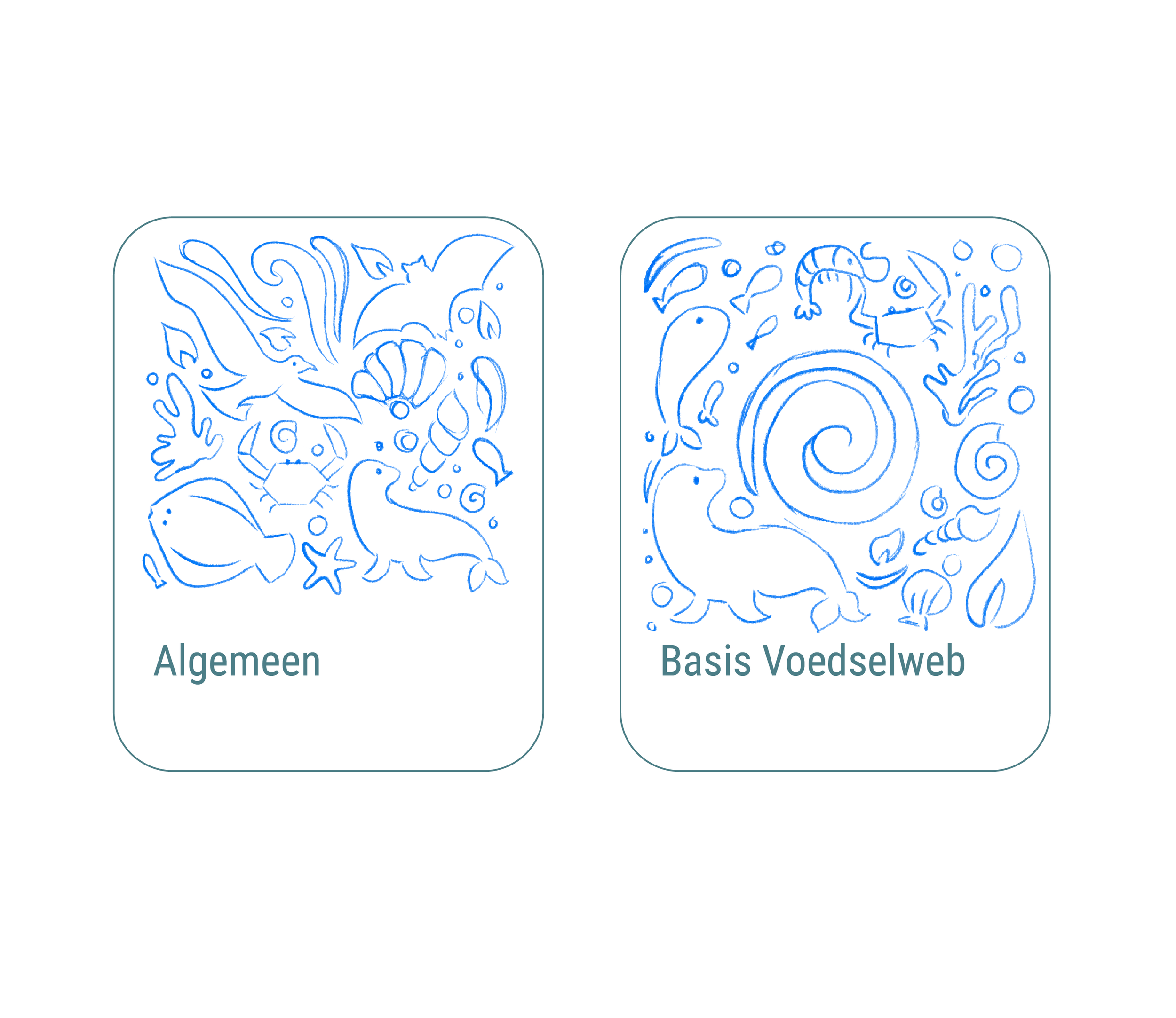
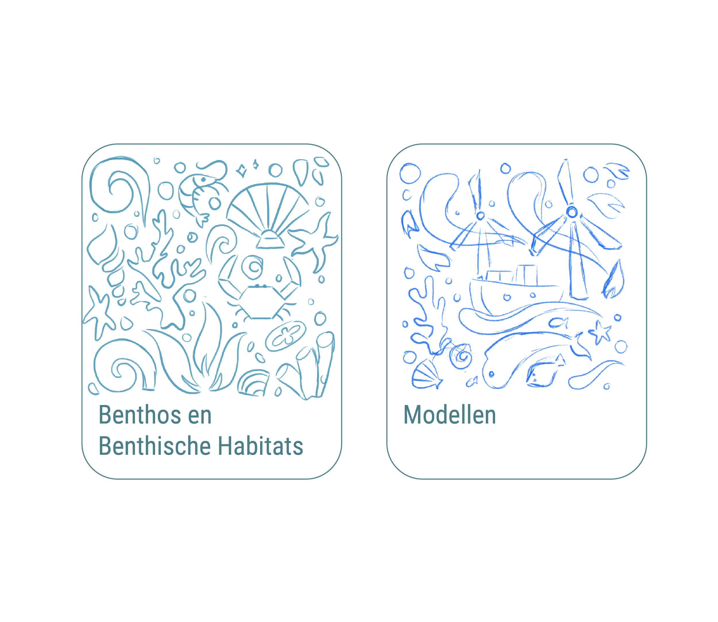
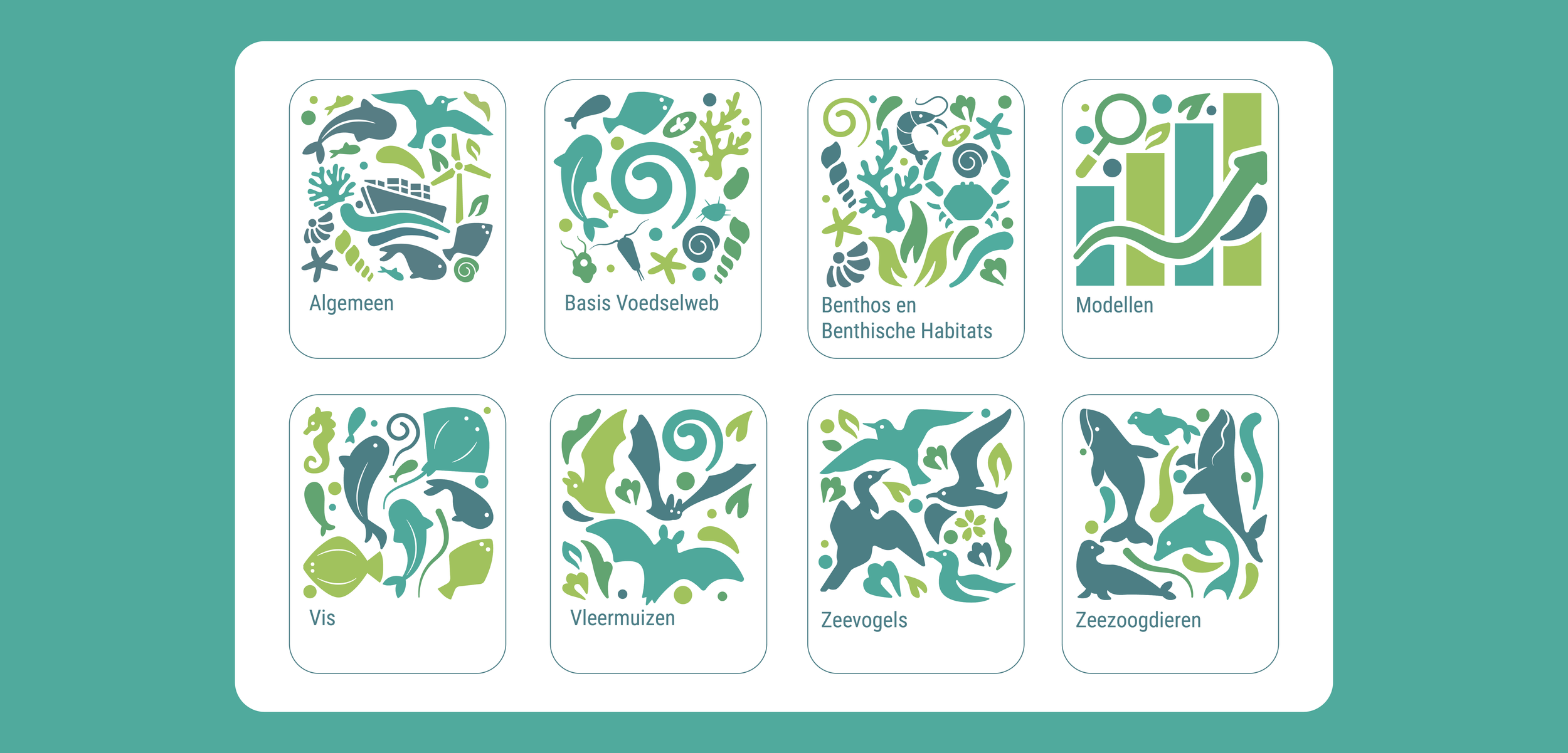
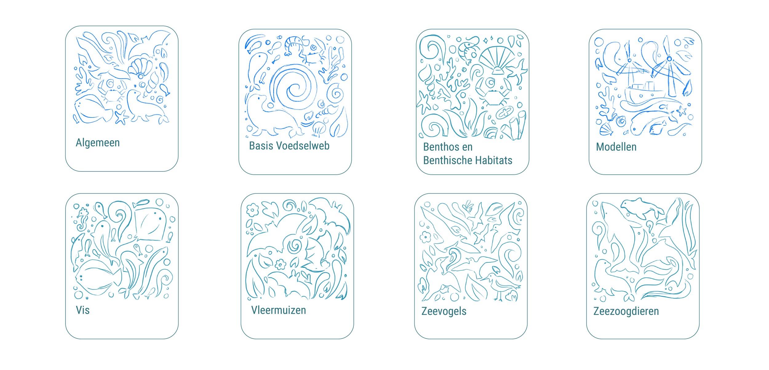
To enhance the accessibility of the institution's reports, I crafted eight distinct icons. Each icon thoughtfully represents various aspects covered in the reports, including diverse biomes, essential marine life, and human interactions with the sea. These visual elements provide a clear and engaging way for readers to navigate complex topics discussed in the institution's findings.
You can see the Report here
This project was created with Clarify
had the privilege of collaborating with the North Sea Consultative Committee to shape the visual identity of Noordzeeoverleg, a consultative body overseeing the implementation of the North Sea Agreement. This comprehensive agreement addresses major transitions in the Dutch sector of the North Sea, including energy, nature and food, and their interconnectedness.
Context
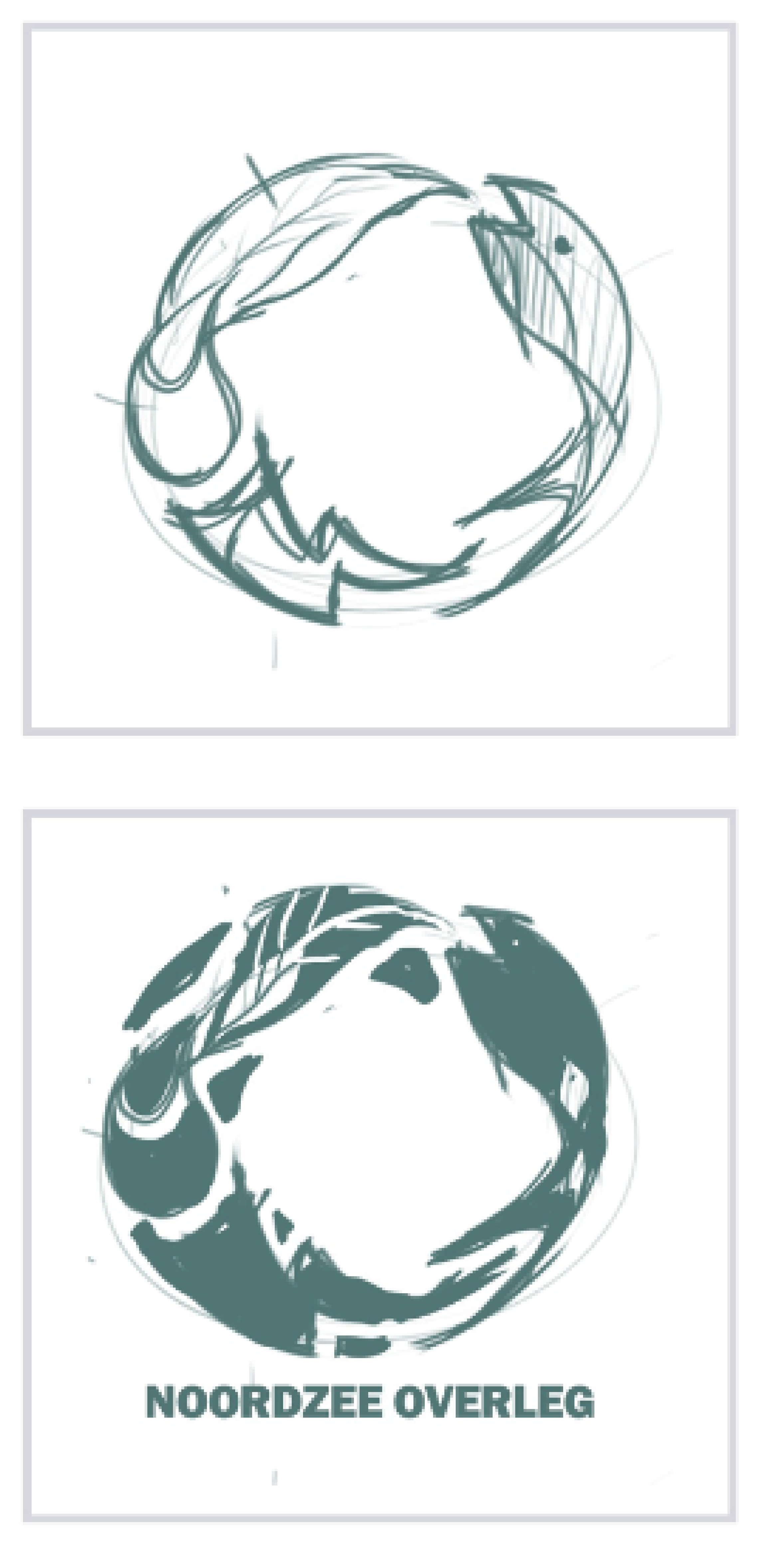
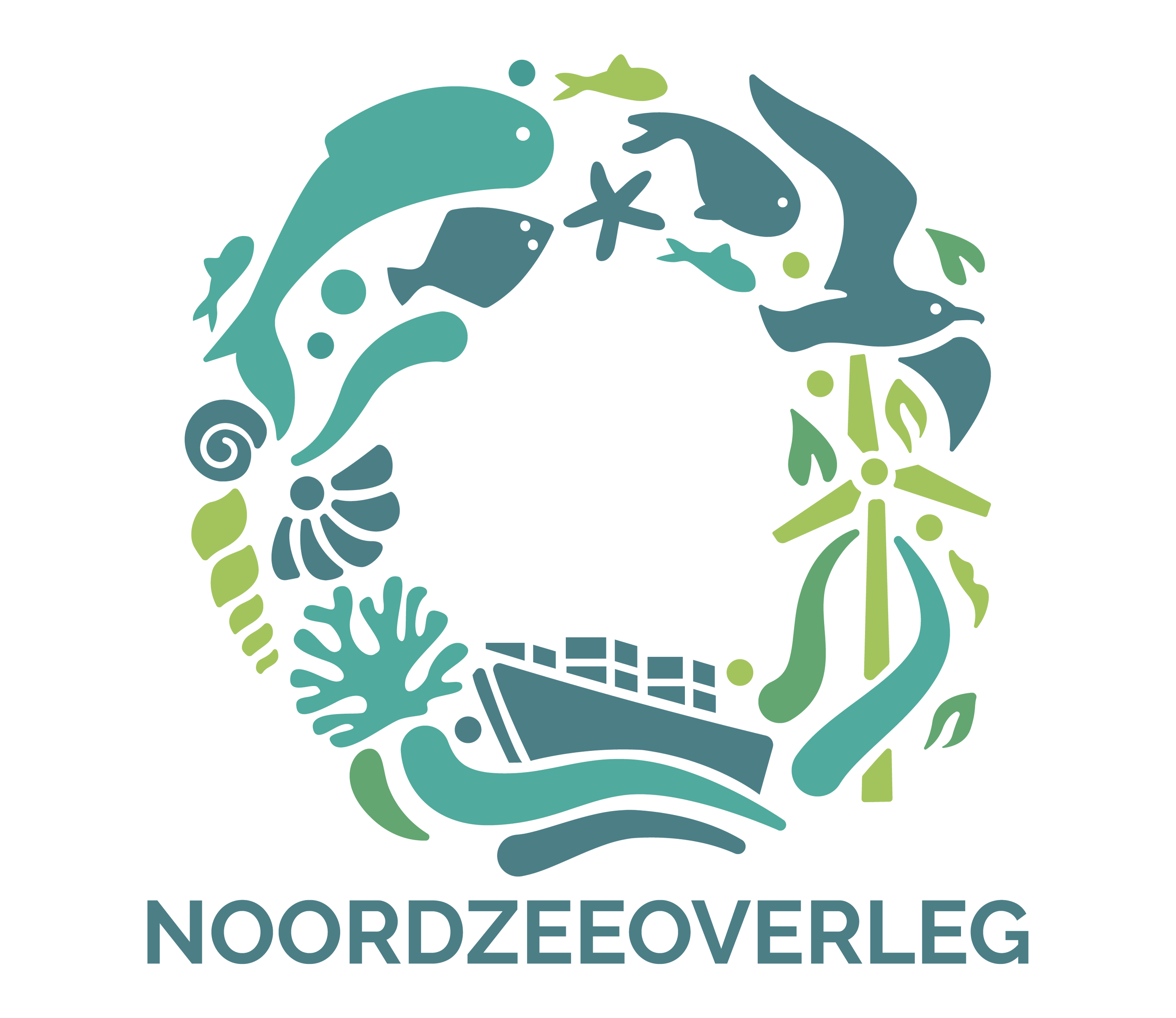
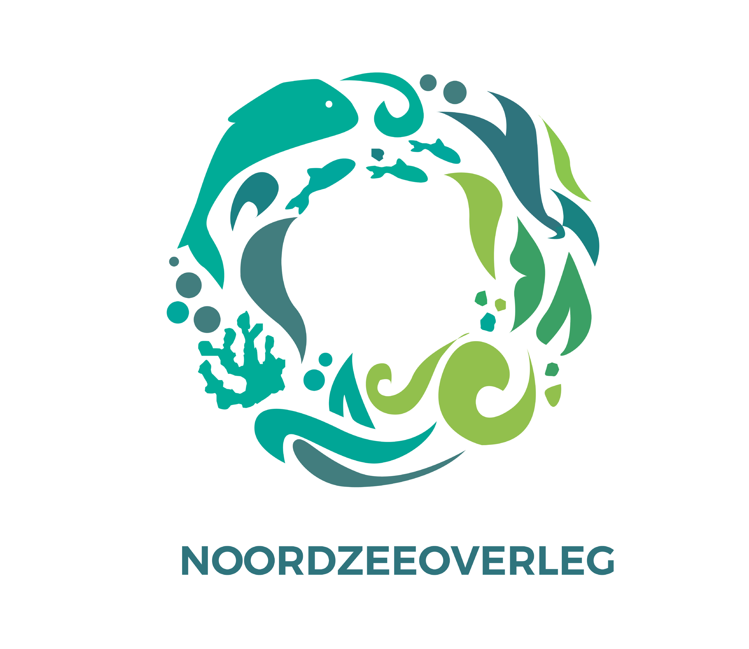
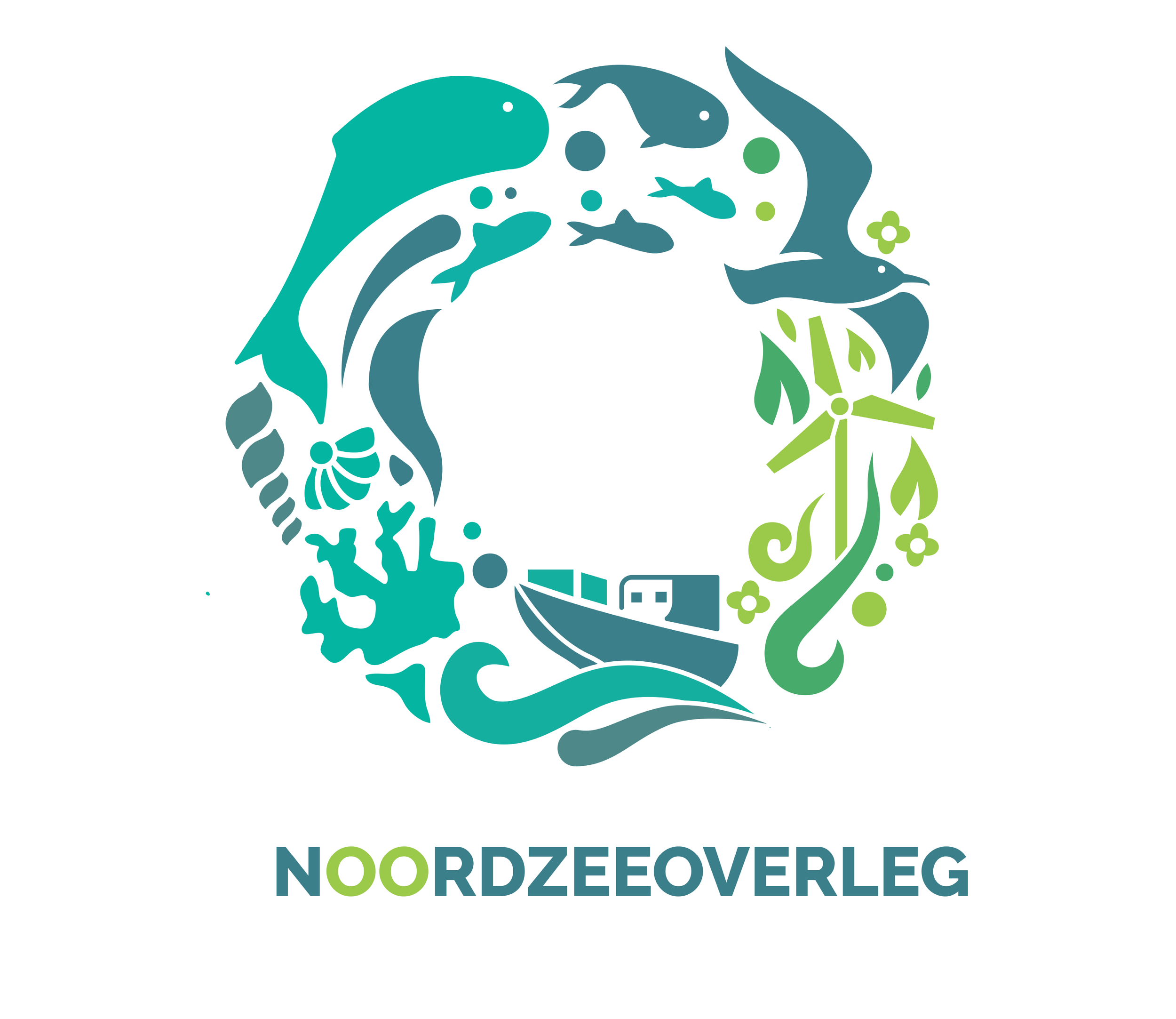
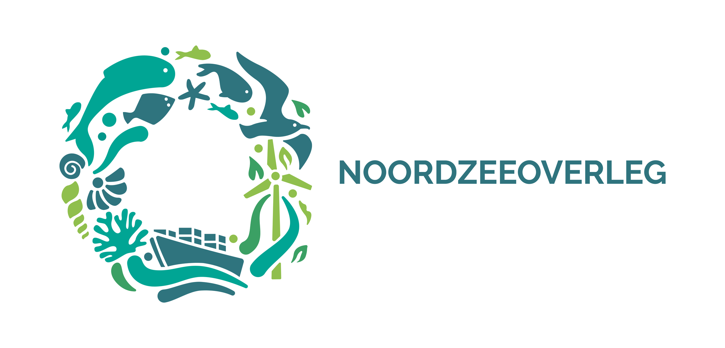
Tasked with crafting the new logo, I integrated key elements symbolizing the institution's diverse interests. Drawing inspiration from the North Sea's vibrant palette, I selected three colors representing the land and two for the sea. The design seamlessly incorporates various biomes, trading, and iconic windmills in the sea, reflecting the organization's commitment to equality, trust, and understanding among stakeholders.
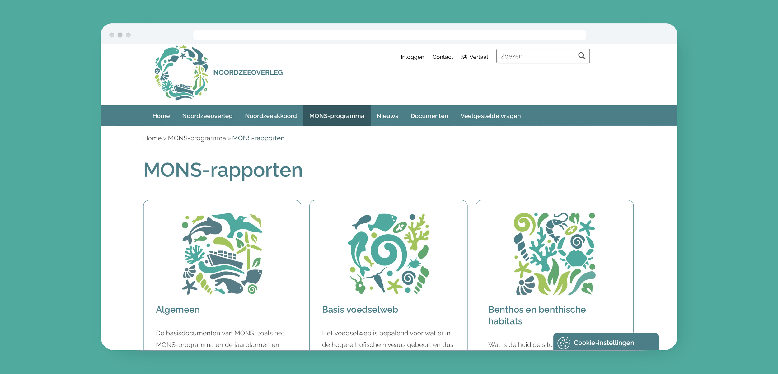
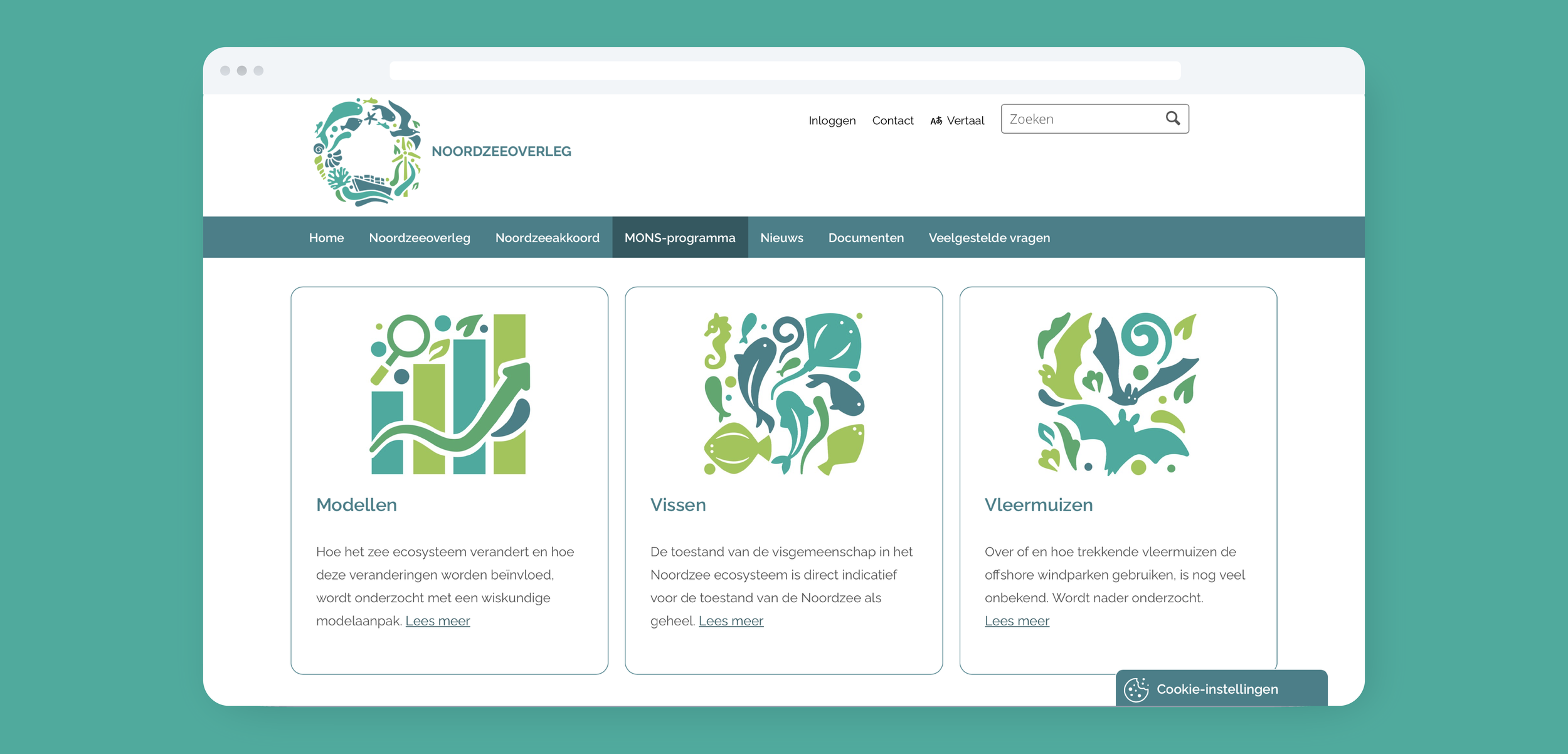
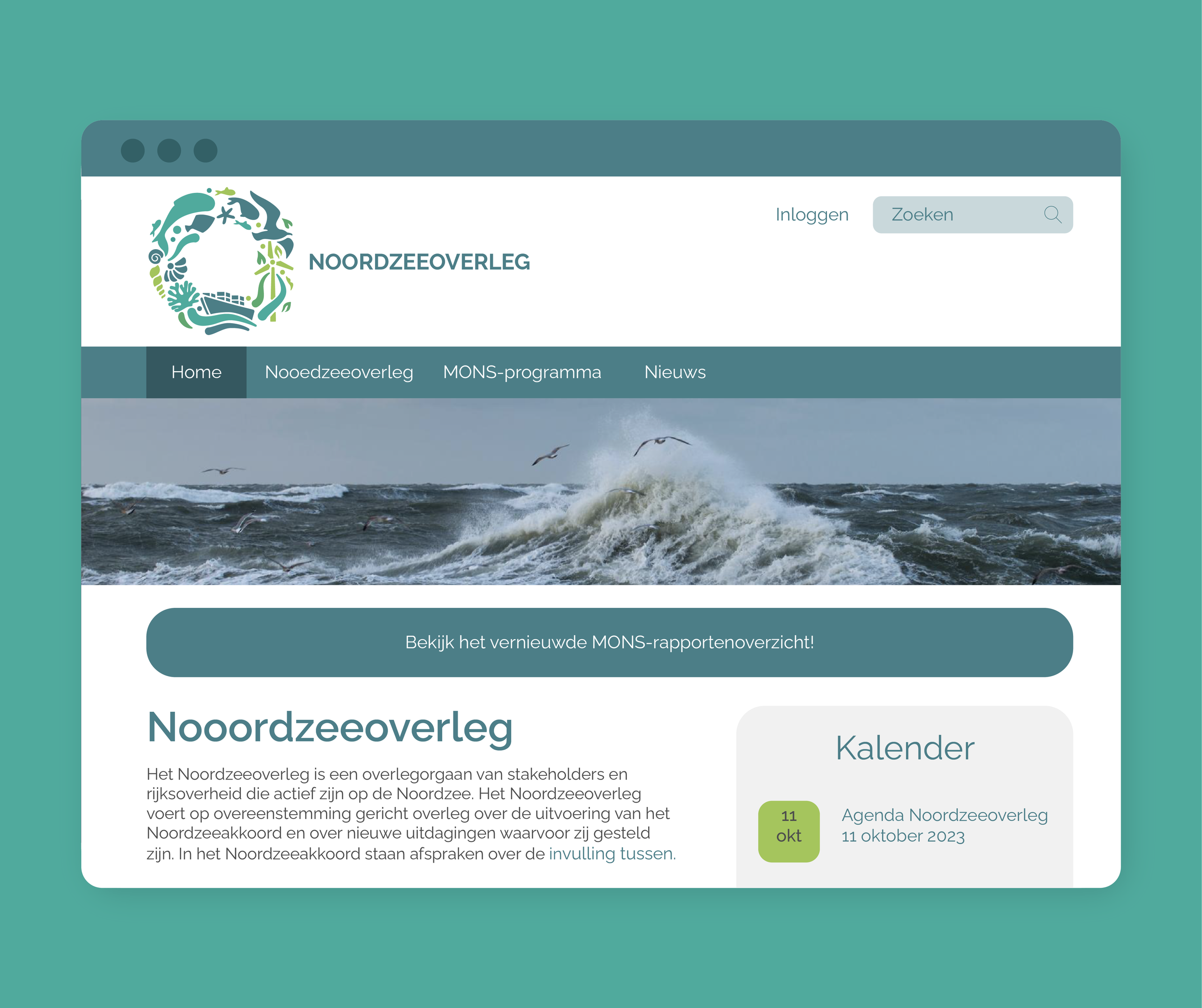
Translating the brand identity into the digital realm, I developed a visually engaging and user-friendly interface for the Noordzeeoverleg website. The design captures the essence of the North Sea Agreement through a harmonious blend of colors, typography, and intuitive navigation, creating a seamless online experience for users seeking information on energy, nature, and food transitions.
You can see the website here